Apple Live Bloggers Reviewed!
TweetSo unless you’ve been living under a rock, you should have heard that WWDC announcements were today. Apple announced all sorts of goodies like new Macbooks, new version of iOS (including an ugly-ass Maps app), and some other stuff. I normally religiously watch these keynotes because I consider it to be an experience (much like watching a sporting event for normal people). One thing I’ve ever heard about but never actually tried, is to “watch it” live via Live Blogs. Its not the same experience, but sometimes it just beats waiting for the real videos to get posted by apple (here). I think Apple has only ever once streamed the announcements live. My guess is they stopped because of the powerful Blogger Lobby insisting they get some sort of exclusivity. Or maybe not. Maybe it’s the Akamai bills. I dunno. But anyways.
As this was a new experience for me, I did a Google search for people doing these Live Blogs. I was expecting some text document that I’d need to manually refresh, but it appears as though technology is getting better where sites are streaming text in, with formatting and pics inline, pause ability, lions and tigers and bears, oh my! So, I’ve reviewed the ones I found so you can place bets with your friends next time as to which “is the best”. So here you have it:
Larry’s Review of the Best Mac-Event Live Bloggers
- Engadget was the site I used to get the majority of my gadget-related news from in the past, so I expected only the best
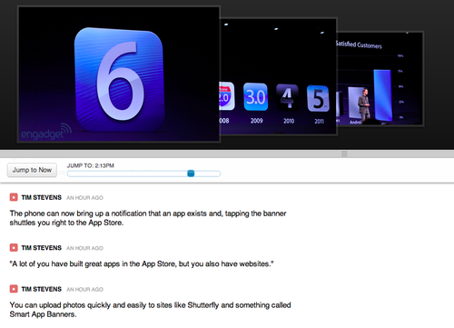
- They have a very nice UI. Very minimal, no ads. It allows you to go back in time easy by either scrolling or sliding the slider.
- What you don’t see in the screenshot is that you actually have the ability to Pause the event incase you get a little too excited and you need a bathroom break while hearing the latest earth-shattering news. The Pause ability is useful because it stops the auto scroll. The only live blog engine that allows you to take breaks.
- Problem is, when Resuming or even scrolling, the pictures at the top often wouldn’t be synced exactly to where my scroll position. It was difficult if the shown picture was before, after or during the text that I’m scrolling at. I’ll hand it to them that they actually tried to sync it though, I didnt see this with any other live bloggers.
- Engadget’s live blog often froze. It was the only one of the 4 I tried which would often require me to F5 (or command-r, bitches!) to have it resume from a broken state. This probably was due to load on their part (and since engadget is super popular), but still at the end of the day, i expect perfection! Yay free, ad-free products!
- The image scroller thing up top was really cool. I liked the animations and fades and all that. Its that bling that made it more enjoyable to watch. Useless features, I know, but it’s the little things.
- I feel like engadget was the fastest at getting pics online. The other dudes were close but engadget in almost all tests showed the latest pretty pics first. This doesn’t mean they were the fastest with text though, but they were definitely acceptable with text too.
- Overall it was a great experience, but the freezing really removed from the experience.
Gdgt:
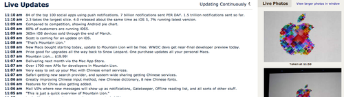
- Gdgt, by the Engadget founders, took a very simple approach. No fancy UI or anything, just a page with lots of pics and text
- The page would auto-refresh, as would be expected, and was kept up to date.
- The problem I found with it is that the pics were so pretty and large that the text underneath would often get pushed down. You’d need to manually scroll to see it. In fact when I tried to take that screenshot above, you cant see the text describing the image.
- If you scroll down to see the image, the page would often auto-update screwing up your current view. There was no way to pause like with Engadget. This is a common problem with self-refreshing auto-updates.
- There’s not much else to say. Like the rest though, they had great coverage.
- Being an avid mac fan (its only recently ive been able to say this), I frequently lurk Macrumors for the latest in made-up Apple news
- I found its coverage for text to be outstanding. Not only it is super readable and no scrolling needed, but I found that they were fastest with getting out the text. Not the fastest with pics (though still fast), if you want to scream to your friends about a favorite new feature, quoting Macrumors is a good idea (ONLY DURING THEIR LIVE BLOGS!!)
- They had images, as you can see, but I found they were often slightly blurry. It’s clear they didn’t have the best camera/photographer, but they weren’t in the way when being displayed, so maybe making them that size was the tradeoff.
- They have the added feature of being able to have the big-picture (though still sometimes blurry) in a separate window (and still autoupdated). Excellent for multi-monitor video watching excitement!
- As an engineer, I actually liked their UI the best, but it’s not as family friendly as Engadget, for example. Lots of data and pics on one screen, hells ya!
- Again, overall, very useful live blogging, recommended.
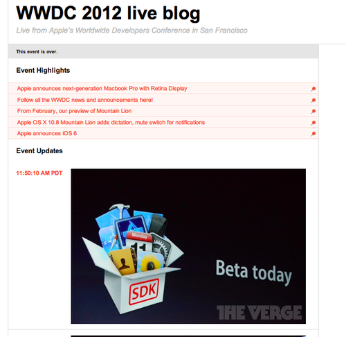
- The Verge was my favorite coverage of the WWDC conference and the one I used to be overly-excited to the people around me (who seemed not to care about apple stuff at all)
- I found that they had the best camera work (no heads in the way) and the best side-commentary.
- Their UI was super simple and the live updating was appreciated (as with all the competitors)
- With text they were 99% as fast as MacRumors and 99% of as fast engadget on pics. Overall, they were preferred because they were consistently either 1st or a close 2nd in terms of mac-goodness-being-released speed. I really liked that i didnt have to place bets with what journalists at other publications liked more and typed faster for. The Verge was excellent for this, almost always winning.
- The Verge was the only publication to include a “Highlights” section where they summarize the big events that happened. I.e. when the new Pros were announced, it would appear as a bullet item keeping you up to date.
- Problem was the highlights section often got large and made the latest-and-greatest news appear pretty low down on the list. I’d have preferred the highlights on the side, or somewhere out of the way.
- The same scroll problems happened with it where if I were to scroll while its refreshing, i’d love my position. No ability to pause.
- I found that sometimes they’d put stuff up out of order. An image would go up and a few seconds later the text would appear underneath. I understand theyre trying to keep chronological for easy viewing later, but for the live watcher, it can be frustrating thinking that you’re missing out on something.
Consensus
My favorite overall was The Verge as it was the best (it was the fastest at giving me the best information with big pics and good text). It had some UI issues, but so did all the others. My Fave might have been Engadget if it wasn’t for the need to manually refresh the page, but hopefully they’ll fix that for next time. But I’ll need to test it in the Full Experience before outright saying it would be better.
Overall, they were all excellent. I thought live blogging was this lame thing that’s delayed and burdensome. But it’s really quite awesome. I’m happy there’s so much competition as we got 4 great competitors here and dozens more online. Now you can have less stress too picking your live blogger next time!
Ok I can’t believe I wrote this article, but there you have it.
Btw, it sucks that Apple didnt make a retina screen for the new Airs. Now i need to lug a high-res heavy-ass brick everywhere. #firstworldproblems i guess.